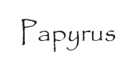
While shopping recently, I came across a doormat that would have been perfectly lovely had it not had a Papyrus welcome message plastered across the middle. Not only is Papyrus unoriginal, it simply isn't attractive.

Austin, you are too unique to use a gimmicky, “unique” typeface like this.

I was distraught and snapped the photo below, almost as if I would be able to turn it into the design police. I was crushed when, back in my hometown of Austin, I spotted some brand new signage near 8th and Brazos … I was walking along, breathing in the artsy, funk that Austin has to offer when I stopped in my tracks as the Papyrus signage caught my eye. Papyrus is so overused that all it communicates is, “I have no original ideas in my head and I designed this in Microsoft Word.” The users of Papyrus seem to think that it is unique and clever … to that I say, on the contrary. Papyrus is commonly found on the awnings of new age shops, “hip” coffee shops, yoga studios, etc. Why the emotion you ask? Well … the fact that anyone turns to Papyrus as their typeface of choice reminds me of how little attention certain people pay to their design and branding. As I sit here and blog about uncool fonts, I can’t help but feel like a cliché design diva, but lately Papyrus has taunted me everywhere I go and I am irritated. If you have any interest in design, typography or even just own a computer, you are probably familiar with oh-so-overused Papyrus.

I’ve always been told that “hate” is a very strong word, but sometimes it's just necessary.


 0 kommentar(er)
